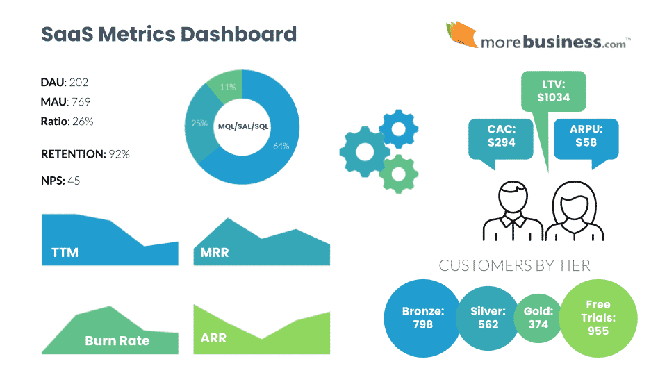
Your SaaS metrics dashboard must include these 9 KPIs so you know exactly how well your strategy is working and what you need to change.
Measuring specific KPIs (key performance indicators) daily, monthly, annually and over a customer’s lifetime allow you to monitor your progress. Knowing these SaaS marketing metrics will give you the insight you need to adjust your support, product-market fit, and other critical business aspects so your SaaS business can succeed.
Table of Contents
9 Must-Have KPIs for Your SaaS Metrics Dashboard
SaaS (software-as-a-service) products are a unique animal. While you still need to measure KPIs that are common in most businesses, there are specific numbers to add to your SaaS metrics dashboard.
At a glance, here’s a list of the SaaS metrics you need to manage to create a profitable business. I’ve bundled a few related metrics together (so yes, it’s a bit more than 9).
- DAU/MAU Ratio
- Retention (Churn)
- ARPU
- CAC and Sales Cycle Time
- LTV and Customer Lifespan
- MRR, ARR, Burn Rate
- MQL/SAL/SQL
- Free Trial or Freemium Conversion Rates
- NPS
I’ll go into detail about each one below, including what your numbers are telling you. Watch your SaaS metrics dashboard trends and take action to get to the SaaS rule of 40, which is a rule of thumb saying that your growth rate plus your profit should equal or exceed 40%. Companies that achieve the rule of 40 have higher valuations than those who don’t.
1. DAU/MAU Ratio
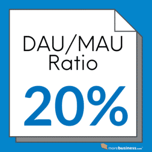
DAU and MAU are defined as daily active users and monthly active users, respectively. Measure the number of people who login to your SaaS product every day as well as every month. Divide the two numbers to get a read on how sticky your product is on a simple scale of 0-1 (or multiply by 100 to get the percentage). The higher the DAU/MAU ratio, the stickier your product is.
- DAU/MAU Ratio = daily active users / monthly active users
It is important to make sure that you have the MAU component in your metrics. If you measured only DAU, it could be misleading because it would include new free trial accounts that result from your marketing efforts alone. The DAU/MAU ratio gives you an indication of product-market fit and potential support issues. Your target ratio should be 20% or higher, which indicates fairly good product adoption.
The DAU/MAU ratio is sadly one of the most overlooked KPIs in a SaaS metrics dashboard. It provides insight into how much your customers are adopting your product. The less they use it, the higher your churn rate will be. This directly impacts your company’s valuation.
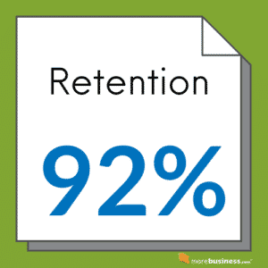
2. Retention (Churn)
While DAU/MAU measures adoption, another SaaS metric you must measure is retention. This tells you how sticky your product is from a different angle: revenue. Higher adoption and retention rates are worth more to an investor (or buyer) because it shows that your business has lower risk.
- Churn = number of paid customers from last period that did not renew this period / number of paid customers last period
- Retention = 1.00 – Churn rate
The period is usually measured monthly or annually depending on your contracts. Retention and churn are related, as they are opposites of each other. Some SaaS metrics dashboards display retention, while others show churn.
Good Retention Rates
Your target retention rates should be at least 90% and ideally over 95%. That means that at 90% of your paying customers renew year to year (or month to month). Anything below 80% will significantly lower your valuation and means that you have a problem, whether it is an issue with support, product-market fit, feature set, or something else.
Example: in order to grow 20%, if your retention is only 80%, it means that you need to add 40% more to your business (20% for growth and 20% to make up for churned customers). If your retention is 95%, then to grow 20% you only need to add 25% compared to 40%, which is cheaper and easier to do.
Think of it this way: in order to stay at your current revenue in this example, you would need to gain 20% in new sales in order to replace lost customers compared to just 5% simply if you had better retention.
Another way to look at it: if you’re growing at 10% but your retention is 90%, you’re basically treading water.
 High retention has a massive ripple effect. It can be the shining star of your SaaS metrics dashboard.
Effectively, high retention means that your SaaS marketing budget goes farther. Even if your cost to acquire a customer remains the same regardless of churn, customer lifespan is longer which leads to more revenue per customer. All these numbers are very important to show in your SaaS metrics dashboard.
In other words, the same marketing investment generates more cash. To investors, your business is a safer bet. That’s why companies with higher retention (low churn) get significantly higher company valuations.
How to Increase Retention
You can increase retention, which typically also increases your DAU/MAU, by adding triggered notifications that prompt your customers to use your product. The more they use it, the less likely they will churn.
Email is the most common way to reach your users outside of your SaaS application. Web browser push notifications are becoming popular, but my initial tests on our www.morebusiness.com site show that adoption is extremely low. For mobile apps, your messages can be on-screen notifications rather than emails.
Here are 7 examples of messaging that will increase SaaS retention:
- User creates account but doesn’t login afterwards: send an email encouraging them to login and set up their account so they can reap the benefits of your SaaS product
- User logs in only once and then goes silent: send an email encouraging them to start their first action
- User took their first action: send a congratulations message and show them what to do next so they return soon
- User hasn’t logged in recently: send a case study about how others like them are seeing success, or tips on using your product to solve problems they may be facing
- User’s free trial is about to expire: send a reminder to upgrade
- User’s free trial expired: send an offer to upgrade, maybe a discount or a free bonus
- User’s credit card will expire this month: send a reminder on the 10th of the month and again before the end of the month with a link directly to the page to update their payment information
A good content marketing strategy can be extremely helpful here. Instead of prodding new users with a note asking them to come back, send them a link to a case study, a use case, or any other form of a story to illustrate your product’s benefits.
When Your SaaS Product or Growth Strategy Needs Work
There are many scenarios that will be specific to your SaaS product so be sure to add those to your mix of user notifications. If you have a good quality product, adding usage-based triggered messages will increase your retention rates.
That said, if you implement these automated messages and don’t see an increase in DAU/MAU or retention, your product may need attention. It means that you probably don’t have a tight product-market fit, which is why this is such an important SaaS dashboard metric!
It also means that it’s time to call customers and ask them what’s holding them back from logging in and using your product. Get honest responses and don’t be defensive when you hear difficult feedback.
You might also like our article on Product Market Fit Questions to Ask Prospects and Customers
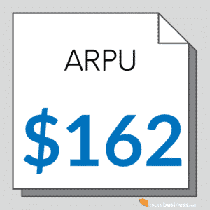
3. ARPU
ARPU is the average revenue per user. This is typically calculated on a monthly basis. This number in your SaaS metrics dashboard shows you how much money you can expect to make for each new paid customer. Another metric is the median revenue per user. It isn’t as common, but I’ve found it to be quite useful.
- ARPU = total revenue / number of users (or customers)
- Median RPU = midpoint of revenue where 50% of users pay less and 50% pay more
 When you take an average over all of the price points you offer, you can see patterns. For example, if you have 500 customers paying $25/month and 100 paying $50/month, you can see that there’s a large gap in the upsell opportunity. However, if you also have 20 customers paying $2500/month, this will skew your ARPU readout. Without knowing the breakdown of users per tier, you could be fooled into thinking that more customers are buying in your higher tiers.
That’s why Median RPU is also handy to add to your SaaS metrics dashboard. It takes into account the number of users by pricing tier.
Along with these two revenue-per-user KPIs, you should also know how many customers you have in each pricing tier and the total value of each tier.
Ideally, you should correlate your time and costs of customer acquisition and for support operations by pricing tier as well. If you find that you’re spinning cycles on customers that don’t generate a lot profit, it’s time to reconsider your business model. Drop the poor performing tiers so you can focus on what’s working better for you.
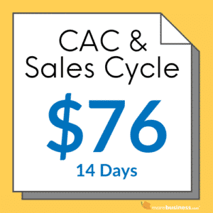
4. CAC and Sales Cycle Time
Cost to acquire a customer, or CAC, is a standard business metric that you should know off the top of your head in any conversation with your executive team and investors. Your obvious goal is to make sure your CAC is lower than your customer revenue or you’ll run out of cash.
Many SaaS business leaders get confused about how to calculate CAC so I’ll show you the simplest method that works for almost all SaaS companies:
- CAC = total marketing and sales cost / number of new customers acquired
 The challenge sometimes lies in team members that wear multiple hats. Parse out the percentage of time spent on sales and marketing and multiply those hours by your loaded staff cost. Then, add in your direct costs such as tools, advertising, commissions and so on to get your total cost. You would normally calculate this number over the course of a year in order to average out any seasonal spending.
A nuance of CAC is to break it down by pricing tier or product line. If your products require different investments by segment, you may want to know how much it costs to acquire a customer in each one. An example could be a self-service version of your SaaS product vs. one that is targeted to enterprises, which require a personalized sales approach.
If you only sell one product with a few pricing variants that require no change in sales strategy, breaking CAC by tier becomes too granular without providing additional insight.
5. LTV and Customer Lifespan
LTV is defined as the customer lifetime value, also known as CLV. Customer lifespan refers to how long the customer pays you for your product. Variations of this value in your SaaS metrics dashboard include ACV, or annual contract value, followed by average contract duration.
 The intent of these metrics is to shine a light on how much each customer is worth to your business financially.
Average LTV is calculated by multiplying ARPU by customer lifespan. So, if you generate an ARPU of $50/month and your typically customer churns after 20 months, then your LTV is $1000.
While it is clear that your CAC must be lower than LTV to survive, the ratio between these two metrics is also important to check.
Divide LTV by CAC: LTV/CAC > 1 (this ratio needs to be more than 1 or you’re spending more to acquire a customer than they’re worth).
Strive for the LTV/CAC ratio to be 3 or better. That means that you generate at least 3x ROI for each customer. The higher this number, the more profitable your customers are.
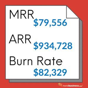
6. MRR, ARR, Burn Rate
MRR, or monthly recurring revenue, is one of the most widely used numbers in a SaaS metrics dashboard. While MRR doesn’t tell the whole story in light of all of the other metrics mentioned here, it does tells you exactly where you stand financially.
It’s your most basic cash flow metric.
A related KPI to MRR is ARR, or annual recurring revenue. This defines your revenue normalized over the course of a year. You also need to keep an eye on your expenses, often referred to as your Burn Rate, to make sure you don’t run out of cash. Together, these numbers give investors, buyers, and your team a sense of your growth.
- MRR = how much money your product generated last month
- ARR = how much money your product generated in the last 12 months
- Burn Rate = what you spent last month to run the company
Your MRR minus your Burn Rate is your cash flow. ARR shows your trailing 12-month revenue (the sum of all revenue in a rolling 12 month period). If you have multi-year contracts, which by the way you should definitely pursue, divide the annual contract value by the number of years on the contract to determine what to include for ARR for these types of contracts.
 If you look at sales strictly on a monthly basis, you can’t account for seasonal variations. Historically, selling in July and sometimes August can be challenging for many B2B SaaS companies because prospects are on vacation. For others, selling in December is difficult for the same reason.
The ARR metric takes seasonality out of the picture so you can see a true growth chart.
Add up all sales for a 12-month period and display it as a bar chart. Do the same for each sequential month.
The trend line you see is your true growth rate regardless of seasonality. If you see a dip, that’s a RED FLAG and you should find out what caused the downward trend immediately. Because this number is for a 12-month period, it signals that there’s something amiss that you must tend to. Downward trends can take time to fix so don’t ignore your ARR signal.
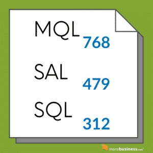
7. MQL/SAL/SQL
SaaS metrics dashboards must also give you insight into how well your marketing is working to generate qualified leads. The key word here is “qualified”. You want to be careful not spend your precious marketing budget on leads who are tire kickers or who will never pay you more than your CAC.
 The lead-to-prospect process works like this: a lead generated by marketing efforts goes to sales to see if it’s a good lead, and if so, sales proceeds with their qualification process and marks the lead as a prospect. This can lead to a personalized demo which converts the lead into an opportunity, which is then documented as a win or a loss.
MQL = marketing qualified lead
An MQL is a lead that your marketing team deems to be qualified enough to pass along to your sales team. This could be someone who downloaded a guide, signed up for a free trial, or provided you with a signal that they are interested in your product.
MQL Breakdown
I recommend having another separate report, perhaps not in your SaaS metrics dashboard, that shows you a breakdown of lead source and track it through the sales process. This is very useful in identifying where your highest converting leads are coming from. You can use this information to ramp up marketing spend on your top performing lead generation sources and cut back on the poor ones.
SAL = sales accepted lead
Once the MQL is handed off to sales, or often your business development or sales development rep (BDR/SDR), they will validate whether the lead passes their sniff test. This stage of the lead flow process typically discovers whether the lead has a budget, is a decision maker, and is trying to solve the problem that your SaaS solution addresses.
SQL = sales qualified lead
The lead then goes to a sales rep then passes through the last stage of the qualification process: the SQL, or sales qualified lead.
Companies sometimes define their SAL/SQL stages differently, depending on whether they have a business development rep, or team, to be the bridge between a marketing-generated lead and one that is qualified to have a discussion with a sales person.
The longer lead flow process is more common for SaaS companies that sell enterprise products. For self-service products, many companies simply track the number of MQLs to free trials, or sometimes just free trials.
Once the SQL is deemed to be an opportunity, you can calculate your win/loss rate by rep. This way, you’ll quickly know how your reps are performing, including who might need more training.
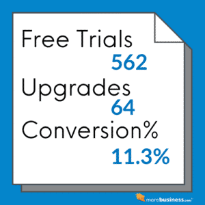
8. Free Trial or Freemium Conversion Rates
A common method of attracting customers is offer a free trial, or even a free version, of your product. In such cases, a critical SaaS metrics dashboard will showcase your conversion rates. You need to know how many customers who are using your free version will upgrade to a paid plan.
These are straight-forward numbers to calculate:
- Free trial conversion rate = number of upgrades to a paid plan / number of free trials
- Freemium conversion rate = number of paid customers / number of total (free + paid) customers
There’s a debate in the SaaS community about which business model works better: free trial vs. freemium. In my experience, having offered both, I’ve found that free trials draw in a more qualified lead.
 Keep in mind that you will incur support costs even for free users. In addition to server costs to accommodate non-paying users, your support team may also need to chime in from time to time.
I recall one incident in which a free user of my previous company’s product, MailerMailer, didn’t read what a particular feature in our product did and proceeded past all of the safeguards we put in place to verify that he wanted to take a specific action. He caused numerous issues for our support and legal teams because of user error – all from a free account. That experience pushed us to modify the feature set available to free users. This, in turn, meant that free users didn’t get to experience all of the features to encourage them to upgrade.
The free trial user, on the other hand, knows they are trying out your product in order to decide whether to buy it. It’s a different mindset, one that may lead to more sales than offering a freemium version.
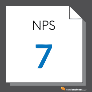
9. NPS
NPS, or net promotor score, refers to a frequently used metric that defines customer happiness. While another score, CSAT, is a rating of customer satisfaction, the NPS measures a customer’s satisfaction of your overall brand, not just an interaction with a particular support rep, product feature, or recent experience.
 As such, it gives you an overall picture of what customers think of you. Pretty important, yes? When you properly manage all of the other items in your SaaS metrics dashboard, you will have a much better NPS.
The NPS is a number between -100 and 100. It is calculated based on a customer’s response to this question:
- How likely are you to recommend [your company] to a friend or colleague?
The scoring range is 0-10 (10 being the highest). Customers who give you 6 or below are detractors, 7 or 8 are passives, and 9 or 10 are promotors.
- NPS = % Promotors – % Detractors
So, if 60% of customers rate your business a 9 or 10 (Promotors) and 15% give a 6 or below rating (Detractors), your NPS is 45, which by the way is a solid score that indicates you have a lot of happy customers.
The higher your score, the more likely you are to retain customers, which reduces marketing costs since you will have to spend less to replace your churned customers. You should not survey any particular customer more than four times a year.
A high NPS is something you definitely want to tout to investors or to a potential buyer of your business. Savvy executives know how hard it is to get a good NPS. Add this number to your SaaS metrics dashboard to keep your finger on the pulse of your brand as a whole.
Add to Your Ideal SaaS Metrics Dashboard
One of the reasons you need a SaaS metrics dashboard in the first place is to help you forecast sales and manage operations. This is essential for you and your team. More so, your investors or board will demand it. You will also have nuanced metrics based on the type of SaaS business you’re running.
Some examples of additional SaaS metrics dashboard items to consider are below.
Upgrades/Upsells
 It’s almost always easier to sell more to an existing client than it is to acquire a new client. If your product is designed to have an upgrade path, such as features that are only available in higher-priced versions, you will find that many customers sign up for a lower tier initially as a way of verifying they like your service. This presents an upsell or upgrade opportunity for your sales team.
As you identify the signals that suggest a customer may be ripe for an upgrade, keep track of how many such opportunities you have each month and their upsell value. When you examine your upsell conversion rates, you will have a predictable number to use in your sales forecast.
Product-Specific Metrics Dashboards
You should also add information that is relevant to your SaaS product. For example, at MailerMailer, my email marketing software company that was acquired in 2017 by Nasdaq:JCOM, we added reports showing the following:
- Daily outbound email volume – this helped us project our hardware and scaling needs since we could see trends over time and ramp up servers accordingly. We sent about 1.3 billion emails per year and our architecture was designed to handle 3 billion, plenty of room for growth. Knowing how fast we were ramping up our volume gave our engineers sufficient notice to add capacity so customers wouldn’t experience issues.
- Top Spam Complaint Customers – in the email marketing software industry, it’s inevitable that you’ll receive spam complaints despite our diligent efforts to screen clients before allowing them to sign up. We needed to monitor any client that could be problematic for our sending IP addresses to avoid site-wide blocking issues. Keeping tabs on customers that generated complaints allowed us to take appropriate action very quickly before things got out of hand.
- IP Scan Status – this is related to spam complaints. We monitored our email sending IP range for any delivery issues so we could address them immediately.
Other data you can include are:
- CSAT – monitoring your customer satisfaction score ranked by support rep can show which reps need more training or mentoring.
- Support Response Time – know how fast your reps are replying to customers and whether their issues are handled on the first attempt.
- Support Tickets by Type – if you find that clients keep contacting you about similar issues, it’s a signal that you should make improvements to your features.
- Sales by Sales Rep – no sales rep wants to see their name at the bottom of this list. It’s a touchy metric so you may not want to display this publicly, as with the CSAT rank-ordered list.
- Thought Leadership Activity – share website statistics on downloads or visits regarding your articles, guides, webinars and other thought leadership activity. This is a motivating list to see because it talks to the engagement of your marketing efforts.
Look at Your SaaS Metrics Dashboard Daily
Having all of this data in your SaaS metrics dashboard is only useful if you look at your numbers regularly and take appropriate action.
At one of my companies, we displayed our main dashboard along with departmental ones on television screens at the office. It was part of our policy of transparency so everyone in the company could see where things stood.
Use your dashboard to run sales and operations more smoothly. Manage your numbers well and you will grow your SaaS company.
Author: Raj Khera, CEO & CMO of 3 SaaS companies – each sold to public firms, and Publisher of MoreBusiness.com